Typography Tips for Marketers: A Guide to Choosing the Right Fonts
Typography Tips for Marketers: A Guide to Choosing the Right Fonts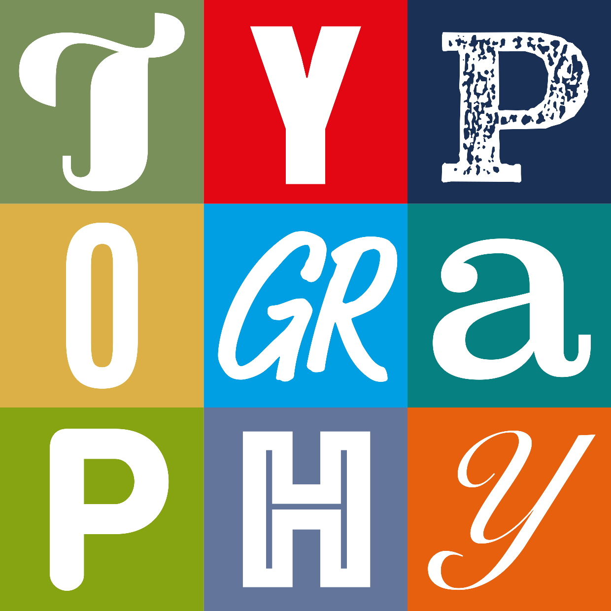
Typography is often overlooked but can be a mighty powerful marketing tool your arsenal. The right font can enhance readability, convey brand personality, and leave a lasting impression. In this blog post, we’ll delve into essential typography tips to help you make informed font choices for your marketing materials.
Understanding the Basics
Before we delve into the nitty-gritty of specific fonts, let’s clarify some terms that will help you going forward
Typeface: A complete set of characters, including letters, numbers, and symbols, designed in a specific style.
Font: A variation of a typeface, such as bold, italic, or a particular size.
Serif: A small stroke added to the end of a letterform.
Sans-serif: A typeface without serifs.
Choosing the Right Font for Readability
Readability is hugely important, especially for content-heavy materials like articles, reports, and emails so we have compiled some tip to help ensure your text is easy to read:
Choose Clear and Simple Fonts: Sans-serif fonts, such as Arial, Helvetica, or Roboto, are very good options for digital content since they are clean and very readable on screens.
Consider both Fonts for Print: Serif fonts, such as Times New Roman or Georgia, can enhance readability in printed materials, as the serifs guide the eye along the lines of text.
Pay Attention to the Font Size: The font size should be selected by medium and target audience. Most of the digital content works best in 10 to 14 points. (Don’t forget to think about accessibility on digital fonts)
Use Sufficient Line Spacing: Adequate line spacing, also known as leading, improves readability by preventing text from appearing crowded.
Using Fonts to Convey Brand Personality
Fonts are not just for heavy content, they also have the potential to speak volumes about your brand’s personality and visual identity. Think about the message you want your audience to feel:
Bold and Edgy: You could use Sans-serif fonts with bold, geometric shapes make for a very modern and bold statement in branding.
Elegant and Sophisticated: Try using Serif fonts featuring delicate strokes and classic designs to look sophisticated and timeless.
Fun and Playful: Have a play with script fonts and decorative typefaces, they can add that bit of whimsy and personality to your brand.
Minimalist, modern and calm: Using Sans-serif fonts with clean lines and minimal ornamentation can project this feeling to your customers.
You can be as creative and playful with your font’s but you still need to have some best practises for font uses:
Limit Your Font Choices: Stick to two or three fonts to avoid visual clutter.
Use Contrasting Fonts: Combine different font styles to create visual interest and hierarchy.
Consider Colour and Background: Make sure there is enough contrast between the colour of the font and the background to ensure accessibility for all.
Test and Refine: Always test your designs on different devices and screen sizes to ensure optimal readability.
If you following these typography tips, you will create visually attractive and effective marketing materials which will invoke feeling that will align with your target audience. The right font can make all the difference!
Is there anything specific you would like to discuss about font pairing, or is there another area of typography that you would like to get into?


