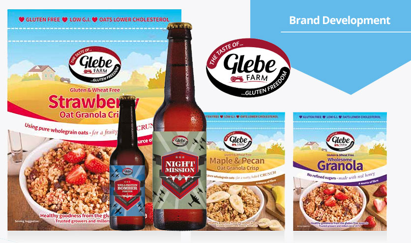
Packaging a gluten free alternative
Glebe Farm have been trusted growers and millers since 1970, producing gluten-free products for the last 8 years.
Based in Cambridgeshire, their range covers cereals, flours, bread and cake mixes, and alcoholic drinks. Their breakfast cereals are made with pure wholegrain oats and are nature’s perfect start to the day.
When they approached us to redesign their logo and packaging, the first discussion centred around the question of ‘evolution or revolution’.
We agreed that evolution was the best approach and so the next question was: what is the core principle of the brand? What do we want to promote in the brand’s image to help it stand out from the competition? Answer – Glebe Farm products are gluten-free and well-established.
With that in mind, our design team set to work. Working closely with the client we made several significant updates to their logo. The first of these was to include the strapline ‘The taste of gluten freedom’, a line that the client felt encapsulated two important aspects of the product. Secondly, we made a subtle but crucial change to the style of the red and black bands that frame the logo to give the overall shape more of the feel of a grain. The third change that was made was in the balance between the name ‘Glebe Farm’ and the agricultural image that accompanies it.
In redesigning the cereal packaging we combined a traditional, idealised illustration of a farm with photographs taken in our March studio. The photographs of the cereal in a bowl, combined with fresh fruit, proclaim freshness and vitality – the very essence of Glebe Farm’s gluten-free products!


